2.1 More Than a Statistical Language
R language is use in many industries such as research in academia, pharmaceutical for clinical trials, finance for risk management, social media for natural language processing and sentiment analysis, manufacturing for predicting demand and market trends and many more.
Below is an example of a reproducible expression in building a simple metric stock analysis in R combined with shiny. We will look into NIO and SPY with a starting date of Jun 01, 2020.
# We will use all libraries through out this chapter
library(plotly)
library(tidyquant)
library(ggplot2)
library(dplyr)
library(dygraphs)
library(echarts4r)
library(timetk)
library(glue)
library(tidyr)

# You can change ticker to whatever ticker you want
ticker <- c("NIO", "SPY")

# tidyquant package for tidy format
StockData <- tq_get(ticker,
                    from = "2019-01-01")

# table format
StockData[1:6,] %>%
  kable(caption = 'NIO vs. SPY') %>%
kable_styling()| symbol | date | open | high | low | close | volume | adjusted |
|---|---|---|---|---|---|---|---|
| NIO | 2019-01-02 | 6.13 | 6.24 | 6.00 | 6.20 | 8823600 | 6.20 |
| NIO | 2019-01-03 | 6.10 | 6.15 | 6.02 | 6.05 | 7562900 | 6.05 |
| NIO | 2019-01-04 | 6.19 | 6.40 | 6.13 | 6.36 | 9405600 | 6.36 |
| NIO | 2019-01-07 | 6.41 | 6.59 | 6.31 | 6.50 | 9709000 | 6.50 |
| NIO | 2019-01-08 | 6.57 | 6.58 | 6.17 | 6.40 | 9603800 | 6.40 |
| NIO | 2019-01-09 | 6.41 | 6.69 | 6.35 | 6.63 | 11489900 | 6.63 |
See below for time series chart of NIO’s daily closing price.
NIOData <- StockData %>% filter(symbol=="NIO")

NIOData$date <- factor(NIOData$date)

# using echarts4r package to draw the plot
NIOData %>%
  e_charts(date) %>%
  # candlestick
  e_candle(open, close, low, high, name= "NIO") %>%
  e_axis_labels(y="Price", x="Date") %>%
  e_datazoom(type="slider") %>%
  e_title("NIO Price History") %>%
  e_tooltip("axis")
Figure 2.1: NIO Price
Imagine communicating these data points to your client without any visual aids. It would take forever. Visualization is a powerful tool, that provides a better understanding of our huge data sets. Figure 2.1, with just a quick glance we can see the x axis as “Date” with a range of Jan 01, 2019 to Aug 04, 2020, y axis as “Price” with a range of 0-18 and ticker symbol NIO. Candlestick charting tells us close, open, low , and high price of the stock on a specific date. We can also use the slider to zoom in on a specific dates.
Visualization amplifies messages and at the same time simplifies communication to an audience. Visualization provides an insight to make better decision.
Lets create another chart comparing the movement of NIO and SPY and see if there is a relationship by creating an imaginary investment of 100 dollars each on NIO and SPY with a starting date of 01-01-2019. Let’s look at the code below:
# clear everything
rm(list = ls())

# ticker symbols
ticker <- c("NIO", "SPY")

# Grab Data using tidyquant package
StockData <- tq_get(ticker, from = "2019-01-01")

# initial investment of 100
NIO <- StockData %>%
  filter(symbol =="NIO") %>%
  select(symbol, date, close) %>%
  mutate(init=100*close[[1]],
         actual = close*100,
         ratio =round(((actual/init)-1)*100, digits=3))
NIO[1:6,] %>%
  kable(caption = "NIO $100 Investment") %>%
kable_styling()| symbol | date | close | init | actual | ratio |
|---|---|---|---|---|---|
| NIO | 2019-01-02 | 6.20 | 620 | 620 | 0.000 |
| NIO | 2019-01-03 | 6.05 | 620 | 605 | -2.419 |
| NIO | 2019-01-04 | 6.36 | 620 | 636 | 2.581 |
| NIO | 2019-01-07 | 6.50 | 620 | 650 | 4.839 |
| NIO | 2019-01-08 | 6.40 | 620 | 640 | 3.226 |
| NIO | 2019-01-09 | 6.63 | 620 | 663 | 6.935 |
SPY <- StockData %>%
  filter(symbol =="SPY") %>%
  select(symbol, date, close) %>%
  mutate(init=100*close[[1]],
         actual = close*100,
         ratio =round(((actual/init)-1)*100, digits=3))

SPY[1:6,] %>%
  kable(caption = "SPY $100 Investment") %>%
kable_styling()| symbol | date | close | init | actual | ratio |
|---|---|---|---|---|---|
| SPY | 2019-01-02 | 250.18 | 25018 | 25018 | 0.000 |
| SPY | 2019-01-03 | 244.21 | 25018 | 24421 | -2.386 |
| SPY | 2019-01-04 | 252.39 | 25018 | 25239 | 0.883 |
| SPY | 2019-01-07 | 254.38 | 25018 | 25438 | 1.679 |
| SPY | 2019-01-08 | 256.77 | 25018 | 25677 | 2.634 |
| SPY | 2019-01-09 | 257.97 | 25018 | 25797 | 3.114 |
# Data Wrangling
NIO <- NIO %>%
  filter(symbol == "NIO") %>%
  select(symbol, date, ratio) %>%
  rename(NIO = ratio)

SPY <- SPY %>%
  filter(symbol == "SPY") %>%
  select(symbol, date, ratio) %>%
  rename(SPY = ratio)

# Combining data frame
StockData <-
  left_join(NIO, SPY, by="date") %>%
  select(date, NIO, SPY)

NIO_h <- StockData %>%
         filter(NIO > 100)


SPy_h <-StockData %>%
        filter(SPY> 30)

ggplot(StockData,
       aes(x=NIO,
           y=SPY),
        color="grey") +
  geom_point(alpha=.5) +
  geom_smooth(method = "lm") +
  labs(title = "Percentage Gain") +
  geom_point(data = NIO_h,
             aes(x=NIO, y=SPY),
             color = "red",
             alpha = .3) +
  geom_point(data = SPy_h,
             aes(x=NIO,
                 y=SPY),
             color = "blue",
             alpha = .3)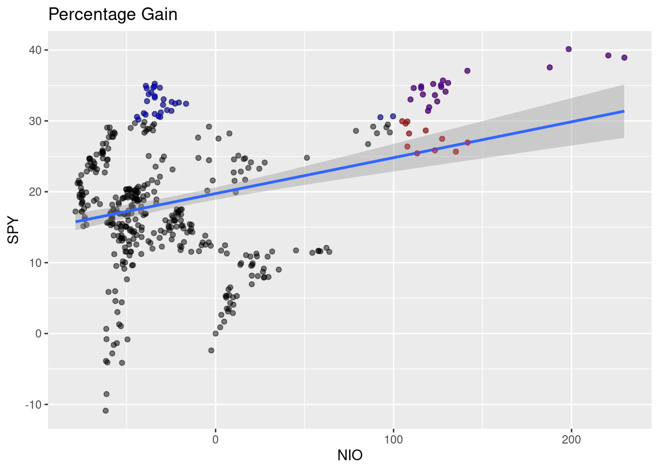
Figure 2.2: Beta
We can see from figure 2.2 that the blue line is almost horizontal with a slightly positive relationship and close to zero - meaning no relationship. The correlation between NIO and SPY is 0.3137118.
StockData$date<-factor(StockData$date)

# using echarts4r package to draw plot
StockData[-1,] %>%
  e_charts(date) %>%
  e_line(NIO) %>%
  e_line(SPY) %>%
  e_datazoom(type="slider") %>%
  e_title("NIO vs. SPY") %>%
  e_tooltip("axis")
Figure 2.3: NIO vs. SPY
Stock Price distribution
# clear everything
rm(list = ls())

# ticker symbols
ticker <- c("NIO", "SPY")

# Grab Data using tidyquant package
StockData <- tq_get(ticker, from = "2019-01-01")

# if needed binning function Freedman Diconis Rule [@fd]
# fd=function(x) {n=length(x) r=IQR(x)2*r/n^(1/3)}

Stock_Dist <- StockData %>%
    filter(symbol=="NIO")

Stock_Dist %>%
  e_charts() %>%
  e_histogram(close,
              name = "NIO Price Distribution") %>%
  e_density(close,
            name = "density",
            areaStyle = list(
              opacity = .4),
            smooth = TRUE, y_index = 1) %>%
  e_tooltip()
Figure 2.4: plotly and ggplot2 package
Plot using base R graphics hist function.
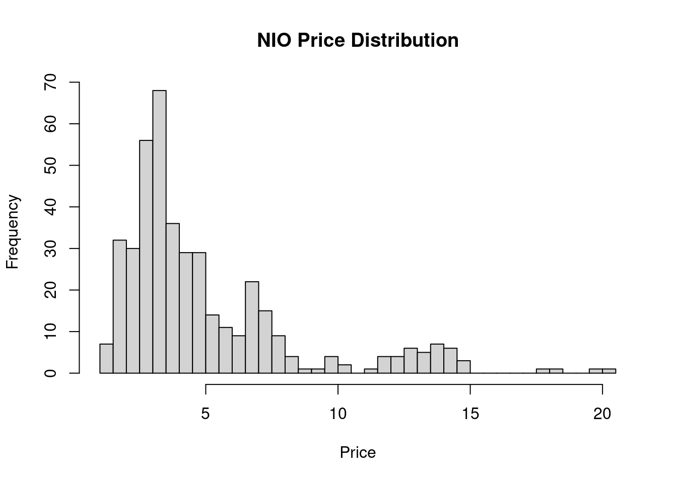
Figure 2.5: base r visuals
Figure 2.4 and 2.5 shows a bi-modal distribution. There are two groups of traders in these charts. The first group bought and sold at around 7 and the other one at 13. There are many variables that we do not see in these two charts such as date and time, current news, trade environment and many more which falls under standard error. The goal is to minimize the se.
Below is another package that turns your ggplot into 3d-plot using rayrender:
library(rayrender)
library(rayshader)
fd = function(x) {
    n = length(x)
    r = IQR(x)
    2 * r/n^(1/3)
}

p2 <- ggplot(Stock_Dist, aes(x = close)) +
      geom_histogram(aes
                     (y = ..density..),
                     color = "black",
                     fill = "grey") +
      geom_density(
        alpha = 0.2,
        fill = "#FF6666") +
      labs(x = "NIO",
           y = "Frequency",
           title = "NIO Price Distribution")


plot_gg(p2, width = 3.5, multicore = TRUE, windowsize = c(800, 800),
        zoom = .65, phi = 50, theta = 0, sunangle = 225, soliddepth = -100)

Sys.sleep(0.2)

render_snapshot(clear = TRUE)![fancy plot [@ray]](r_full_stack_files/figure-html/02-fancyplot-1.png)
Figure 2.6: fancy plot (Morgan-Wall 2020)
Once we combine all of these graphs. We can build a minimum reproducible product using Shiny. Click to see.
Now, that you’ve seen the power of R. What do you think?
References
Morgan-Wall, Tyler. 2020. “Rayrender.” https://github.com/tylermorganwall/rayrender.